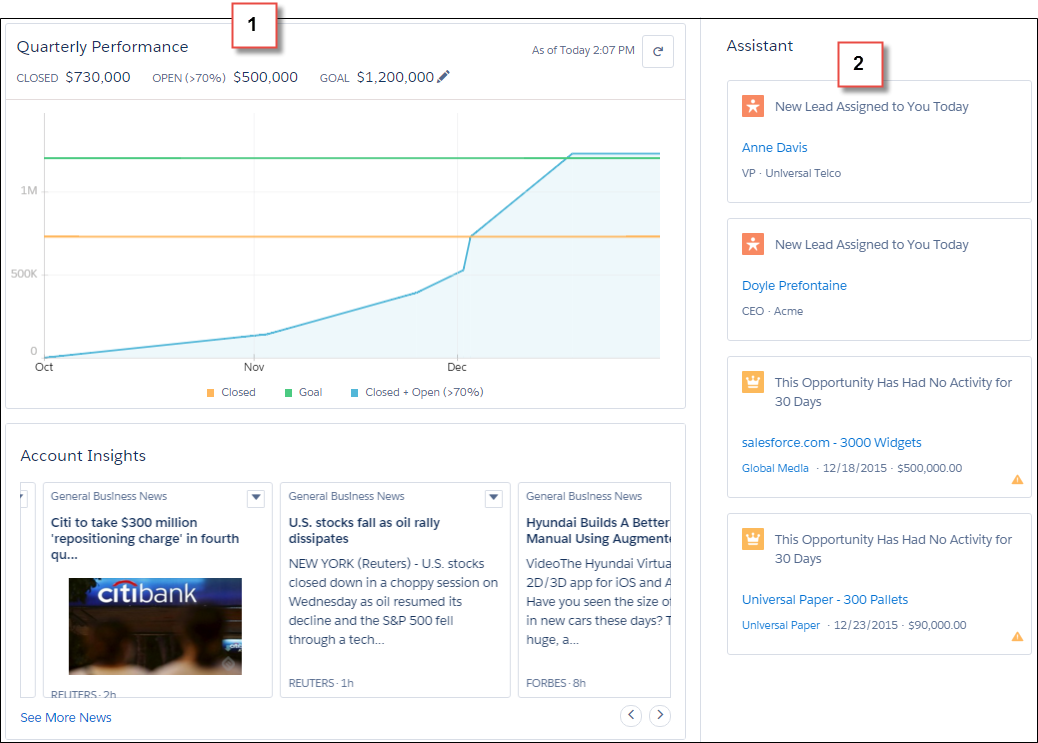
 My last article covered the new Salesforce Lightning Experience. Since then, I have heard quite a few questions about how to come up to speed with the new experience. As with most Salesforce related learning questions, Trailhead has to be your first stop.
With the global preview on August 25, four new, Lightning-focused modules were released in Trailhead. The new modules range from the Sale Rep’s experience as an end user through everything Developers should know about Lightning.
If you are an Admin, don’t worry there are modules for you as well. If you are starting out as a new admin with Lightning, check out Starting with Lightning Experience. For admins planning a migration, Migrating to Lightning Experience helps you understand the new experience and plan a successful migration.
Developer Trail – Lightning Experience
While I have earned all my badges for the user, and admin trails, I am almost through the Developer trail. With over 10.5 hours of great content in this trail, I want to bring the highlights to you now. Within the Developer Lightning trail, there are 5 modules.- Lightning Experience Basics – this is the basics of getting started with Lightning. This module is also cross-listed in the other trails. So if you finish the module in Admin, you do not have to repeat it in the developer trail. This module shows you everything about the Lightning Experience and how to enable.

- Lightning Experience Development - understand how our new UX impacts Apex, Visualforce, APIs, and more. This is an important module to understand the programmatic changes, new approaches and limitations with Lightning. Lightning Components have a staring role in the Lightning Experience and can even be used with Visualforce pages. It also covers how to work with AppExchange apps. The good news is most of what was built before, continues to work.
- Visualforce & Lightning Experience – learning how to use Visualforce to customize the Lightning Experience. This also covers how Visualforce can coexist in both the classic and new experience. There are even good code snippets for determining which experience you are in, such as this JavaScript function
isLightningExperienceOrSalesforce1() {
    return((typeof sforce != 'undefined') && sforce && (!!sforce.one));
}
- Lightning Components – building the reusable components to utilize in the Lightning Experience. If you have completed the prior Trailhead modules on Lightning Component development, you will be right at home with this module. I have left this as the last module to complete, as I worked through the prior Lightning Component modules.
Lightning Design System
The last module covers a new approach from Salesforce for App development. The Lightning Design System module introduces the new design guidelines and CSS framework that Salesforce has released. I am going to cover the details of several challenges in this module that I found very interesting.
First, there is the design system itself, which you get get at https://www.lightningdesignsystem.com. With this system, it is easy to build apps that use the new look and feel without needing to create custom CSS. You may have heard of other design systems like Twitter Bootstrap and this is Salesforce’s system for building enterprise apps. Some of the benefits of the design system include tailored to building Salesforce apps, baked-in accessibility as well as regular updates. In fact, v0.9 was released two days ago. Four types of resources within the design system help you build great apps
- CSS framework – defines the UI components, including a grid layout system
- Icons – png and svg (including spritemaps) for custom and standard objects, actions, utilities and doctypes
- Font – a new Salesforce Sans font for a unique look and feel
- Design Tokens – customize variables for color, font, spacing and sizing with your favorite tools like Sass or Less
Next, the design system is meant to be used across technology stacks including Visualforce pages, lightning pages and components, mobile apps as well as stand alone web apps. Finally, the core design principles within the design system are built around clarity, efficiency, consistency and beauty. All great points to keep in mind when creating apps for users and a great benefit for developers who may not be versed in design principles.
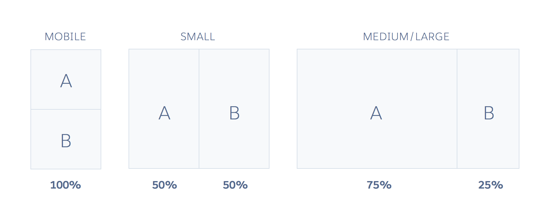
The second challenge to share with you is the grid system, which is the heart of the layout in the design system. The design grid is built based on CSS Flexbox and provides a flexible, mobile-first, device-agnostic scaffolding system. For those who are familiar with other grid systems, this section will be a breeze. However, it is a great tutorial for those who are new to responsive design. With the need to be mobile first and support a wide variety of devices, responsive design is a must. A design system that includes the components you need to build great apps is a huge benefit.

I have just managed to scratch the surface with what there is to learn about the Lightning Experience in Trailhead. Head on over to the site, find a module of interest and get learning.
No comments:
Post a Comment