A client recently requested the ability to look at two charts on the same dashboard in Salesforce Analytics Cloud, each with its own set of date ranges. For example, being able to look at average sales amount for the current year in one chart and the prior year in another chart.
While this may seem like a daunting request at first, it's actually quite simple to build this dashboard. In fact, it can be done without any SAQL and only a few lines of JSON. Here is how to build it.
Dashboard Template
The first step was to create a Dashboard. Picking the Comparison Dashboard template helped jump start the process.
If you haven't used templates before, they are a handy way to handle common scenarios like a Detailed or Summary Dashboard. The templates also give your dashboards the same look and feel, which improves user adoption.
If you haven't used templates before, they are a handy way to handle common scenarios like a Detailed or Summary Dashboard. The templates also give your dashboards the same look and feel, which improves user adoption.
Layout Modifications
Next, remove some of the extra components to simplify the dashboard layout for this exercise. In this case, remove the extra filters section. You could keep these if needed, just be sure to bind them to the appropriate charts.
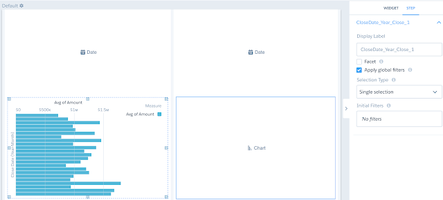
Then, extend each of the Item A and Item B sections to fill half of the screen each. Finally, remove the number widgets and add two date selectors.
Steps
For the first step, use a simple Opportunities dataset grouped by Close Date Year-Month with Average Sales and assign to to the first Chart. Then, go to Step properties and uncheck Facet.
Unchecking Facet turns off the auto-filtering in a dashboard. Faceting is where a change to one widget effects all the others. While this is a great feature that enables easy exploration, it would prevent two charts of the same data from operating independently.
Next, use the clone option to create another copy of the same Step. As it is a clone, the Facet option is already unchecked. Assign this Step as the second chart.
Finally, select the Close Date field as the date field to drive each of the Date selectors. For each of these dates, uncheck the Facet option. If Facet is left checked, the date filters would change each other when a selecting was made.
Bindings
Now we have a couple of charts and date selectors that operate independently. However, the charts are too independent as changes to the Date Selectors do not change the results!
Time to bind each chart to the appropriate date selector in the JSON. Remember to access the JSON for a dashboard, use CTRL-E on Windows and CMD-E on Mac
Time to bind each chart to the appropriate date selector in the JSON. Remember to access the JSON for a dashboard, use CTRL-E on Windows and CMD-E on Mac
To make life easier, change the step names to Date1 and Chart1 as well as Date2 and Chart2 in the JSON fore each of the steps. Otherwise, the names are similar to CloseDate_Year_Close_1 which is cumbersome to work with.
Then to bind each chart to its Data selector, add the following to Chart1's compact form. This adds a filter based on the first Date selector.
Then to bind each chart to its Data selector, add the following to Chart1's compact form. This adds a filter based on the first Date selector.
"filters": [
    [
        "Close Date",
        [
            "{{row(Date1.selection, [0], [\"min\", \"max\"]).asObject()}}"
        ],
        ">=<="
    ]
]
Next, add a very similar filter to Chart2. Remember to use Date2 instead of Date1.
"filters": [
    [
        "Close Date",
        [
            "{{row(Date2.selection, [0], [\"min\", \"max\"]).asObject()}}"
        ],
        ">=<="
    ]
]
With this Binding statement, the min value selected in Date 1 is applied as the start of the date range filter and the max value applied as the end of the date range. This works both for absolute and relative dates.
For example, if the Date selector was set to show 4 months ago to this month, the related filter from the bindings statement result would be:
For example, if the Date selector was set to show 4 months ago to this month, the related filter from the bindings statement result would be:
"filters": [
    [
        "Close Date",
        [
            [
                [
                    "month",
                    -4
                ],
                [
                    "month",
                    0
                ]
            ]
        ],
        ">=<="
    ]
]
Comparison Time
This give us a handy dashboard that we can independently filter. The concept can be easily expanded to include additional filters. Some filters could be set to operate on both charts by binding to both. Or the filters can be set to filter a specific chart.
The full dashboard JSON is available in my GitHib repository.
The full dashboard JSON is available in my GitHib repository.


No comments:
Post a Comment