Showing posts with label explained. Show all posts

Tuesday, November 21, 2023

Preserving CRM Analytics Dashboard Formatting When Deploying

You've built a beautiful CRM Analytics full of customization such as table column names, formats, and conditional formatting by grouping value.


Now, it's time to move this to production.  You can either deploy from the sandbox with change sets or use the Metadata API with your preferred tooling.  It's rather straightforward to select the dashboard name and complete the deployment. 

Except there's a problem. All that super styling work you did is gone. You're left with a sad looking dashboard.


What went wrong and how can we fix it? We need to dive behind the scenes of CRM Analytics to understand where our customization are stored.

Tuesday, October 16, 2018

5 Steps to Killer Einstein Analytics Dashboards

Building great dashboards in Einstein Analytics is a combination of art and science.  You can build pretty visualizations.  If a user can’t take action from the dashboard, it won’t be used. If you throw tons of data at users and they can’t draw insight from it, the dashboard will be ignored.

Dashboards need to be a visual representation of the user’s business goals, with insights that are actionable. Both the art and the science are required to create a meaningful dashboard that engage users.  Here are 5 steps to building killer Einstein Analytics dashboards that users will love.


Wednesday, April 12, 2017

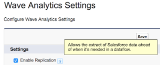
Salesforce Wave Explained - Replication


Salesforce Analytics Cloud includes a replication feature that will pre-populate Wave with Salesforce data.  Replicated data can greatly improve dataflow execution times.

Enabling replication also consolidates multiple digest statements in dataflows into a single extract.  If you have used the Dataset builder and selected the same object more than once, your dataflow will digest that object multiple times.

Simply check the option and away you go....well almost.  There are a few considerations to take into account when using replicated data.  Here's what to keep in mind as well as a list of my Tips & Tricks.

Tuesday, March 21, 2017

Salesforce Wave Explained - Independent Chart Comparison


A client recently requested the ability to look at two charts on the same dashboard in Salesforce Analytics Cloud, each with its own set of date ranges.  For example, being able to look at average sales amount for the current year in one chart and the prior year in another chart.

While this may seem like a daunting request at first, it's actually quite simple to build this dashboard.  In fact, it can be done without any SAQL and only a few lines of JSON.  Here is how to build it.