Tuesday, November 21, 2023

Preserving CRM Analytics Dashboard Formatting When Deploying

You've built a beautiful CRM Analytics full of customization such as table column names, formats, and conditional formatting by grouping value.


Now, it's time to move this to production.  You can either deploy from the sandbox with change sets or use the Metadata API with your preferred tooling.  It's rather straightforward to select the dashboard name and complete the deployment. 

Except there's a problem. All that super styling work you did is gone. You're left with a sad looking dashboard.


What went wrong and how can we fix it? We need to dive behind the scenes of CRM Analytics to understand where our customization are stored.

Friday, June 16, 2023

CRM Analytics Save Error - Value required for [actions]

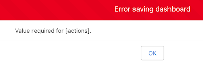
After the Salesforce Summer 23 release, I've encountered this error when attempting to save a dashboard after making changes - Value required for [actions].

What makes this error odd, is the dashboard modification had nothing to do with actions.


Value required for actions error message

A quick look at the dashboard JSON revealed the following interactions node on a table in the widgets collection.


Going to the table on the dashboard and clicking the Interaction tab revealed the following. If there is a partially configured interaction, you won't be able to save the dashboard.  For example, the Click event was established, but no actions defined.


Simply removing the Interaction by using the x on the right allowed the dashboard to be saved.


Monday, January 17, 2022

Salesforce Multi-Factor Authentication with LastPass Business

With the Salesforce requirement to use MFA, LastPass Business can be used to generated Time-based One-time Passwords. The following video walks through the steps on how to configure this setup.


Tuesday, December 29, 2020

Obscure Data Sync Error

Error Icon

 Here's another entry for the obscure, random error file.  It's one of those situations where there's not any other articles out there that match the error message that occurred in Tableau CRM (formerly Einstein Analytics). 

So here's the background and resolution for when your data sync jobs start randomly failing with an "Something went wrong while executing the remoteSync" error.


Tuesday, April 7, 2020

Tuesday, March 17, 2020

Examining COVID-19 with Einstein Analytics

There are many visualizations of the COVID-19 outbreak, including Tableau resources and an online dashboard from John Hopkins Center for Systems Science and Engineering (CSSE).  I hadn't found a source for the Salesforce Analytics enthusiast out there.  So I decided to build my own and share it with the community.


Data Source

I started with 2019 Novel Coronavirus COVID-19 (2019-nCoV) Data Repository by Johns Hopkins CSSE, which is available as a github project.

The repository includes time series files that report confirmed, deaths and recovered by country and state/province.  There were a few challenges with the data format, as each new day of data is a separate column.  Einstein Analytics prefers data in denormalized format, with the date as a row of data.

In addition, some of the columns had missing data, such as as the state/province not applying in certain country. When displaying data on maps, Einstein Analytics is particular about the name of the country or region.  There were a few places the required adjustments.  Sorry Czechia, I had to change you to Czech Republic.

Next, the granularity of data changed over time.  For example, in the United States data was reported at the county level (King County, WA) before switching to be at the state level (Washington) about a week ago.

I decided to give Python a try to modify the data before uploading.  While I am not an expert, it was pretty easy to do replacements with pandas DataFrame replace and then melt to change the daily data into rows.


Einstein Analytics

With data ready to analyze, it was time to upload the csv file.  Next, there are a few metrics that I wanted to calculate with a dataflow, such as the first date of a confirmed case in a country or state as well as the number of days since the first confirmed case.  Using a compute relative and compute expression in the dataflow helped meet this need.  

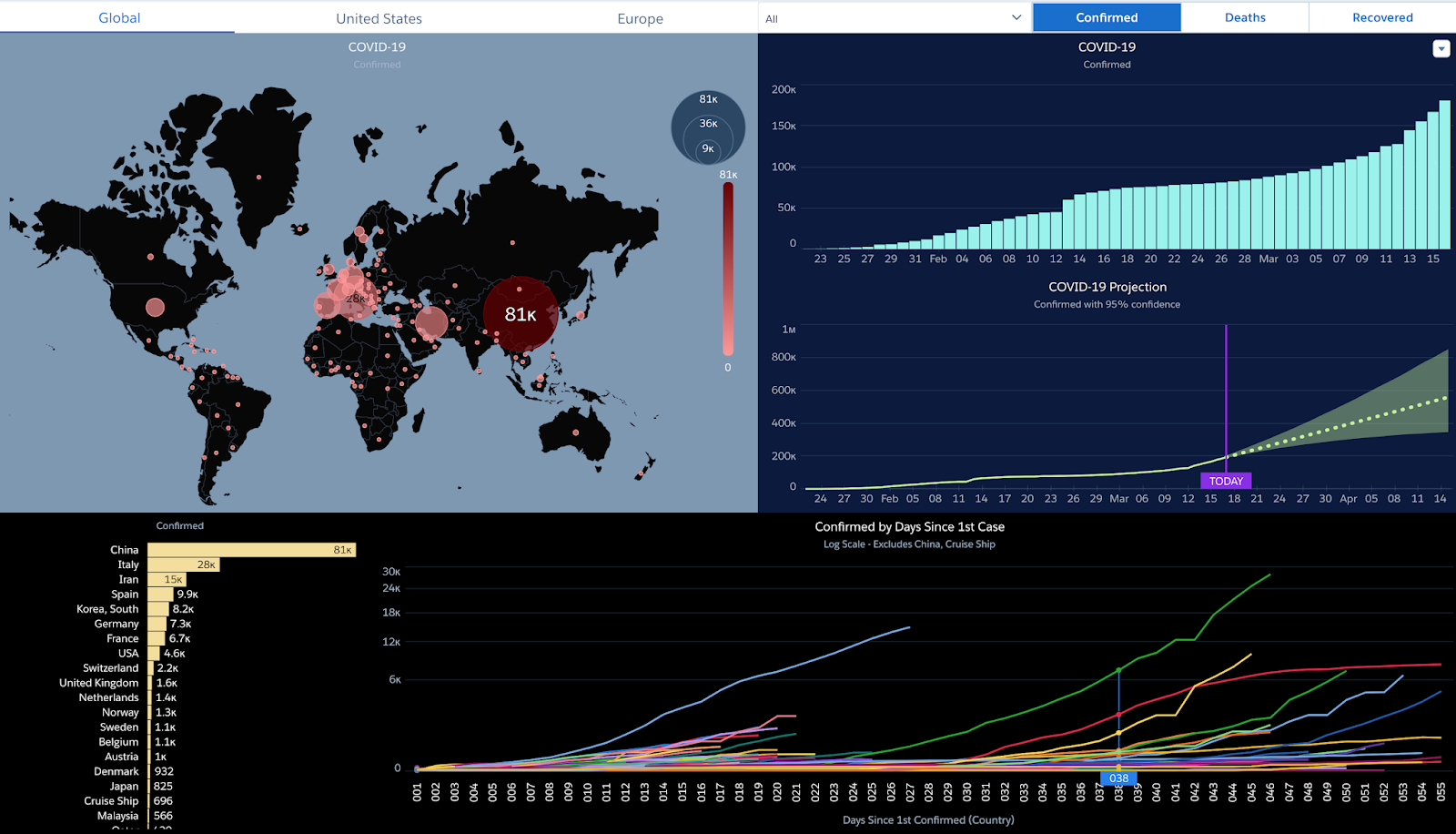
With the data ready, it was pretty easy to create a dashboard of insights. Like most analytics projects, this was an iterative process.  The dashboard that started with one map and one chart, now has three tabs showing similar data at the global, US and Europe levels.  

There is also the ability to switch between confirmed cases, deaths and recovered patients. The dashboard currently shows the following visuals:
  • Map of metrics
  • Growth over time
  • Time series prediction of the next 30 days
  • Country or state ordered by metrics
  • Comparison over time by country or state based on the first confirmed case

A special note on the time series prediction.  This can vary widely based on the available data points.  There are confidence intervals based on the forward projection.  Be sure to use this information with a critical eye and I sincerely hope some of the projections here are grossly inflated.


Installation

Finally, I packaged the Analytics Template into a managed package.  Once you install the package, you can create a new App in Einstein Analytics.
  • Navigate to Einstein Analytics
  • Create App from Template
  • Select COVID-19 app
  • There are no options to select, simply provide a name
  • Once the template setup completes, you are ready to go
The app will install a dataset from the csv file and use a dataflow to enhance the metrics. You can then view the associated COVID-19 dashboard.

Prerequisites

The following should be enabled before installing the package.
  • Einstein Analytics enabled (Setup | Feature Settings | Analytics | Getting Started)
  • Enable Analytics Templates (Setup | Feature Settings | Analytics | Settings)
  • Manage Templated App System Permission
    • Create a Permission Set and assign to your user

Install the managed package from the following links.  Each day's data is represented as a new version.

  • 4.10
    • Includes latest data
  • 4.7
    • data update
  • 4.4
    • changed new by country to be growth rate (new/prior)
    • added new by state for US
    • data update
  • 3.32 (April Fools Day)
    • data update
  • 3.31
    • added new by country to global
    • data update
  • 3.30
    • data update
  • 3.28
    • used the daily data to rebuild the dataset!
    • fixed date rollover with GMT and blank maps
    • data update through 3/28
  • John Hopkins deprecated the data file and has created new formats.  Will need to rework the data acquisition layer when I have time available.
  • 3.23
    • added ability to change duration metric
    • data update
  • 3.20
    • data update
  • 3.19 
    • includes new case measure
    • updated dashboard visuals
    • corrected confirmed by state 1st case 
    • data update
    • note: source data does show decrease for Washington from the prior day
  • 3.18 
    • correct South Korea and includes Confirmed New Cases measure
    • data update
  • 3.17 
    • initial version

Upgrading

If you've already installed a package, the steps to upgrade are the following

  • Install the latest managed package.  You will be prompted to upgrade while preserving data
  • Within your Einstein Analytics app, there will be an option to update
  • Click New version is available and decide to create a new app or update the existing one
  • This will update the latest analytics assets


Data updates

The app template update does not update the Covid Raw Data set with the latest version of the csv.  You can either create a new app to get the latest or update the data manually. 

Data files and associated schema .json file is available on my github repository.
  • Click on Covid Raw Data and select Edit
  • Use the Replace Data option
  • Specify the covid.csv
  • Specify the covid.json Data Schema File
  • Click upload

After the file is loaded, be sure to execute the dataflow to update the Covid Enhanced dataset.  Read more about automating the process in this post.

Feedback


Give it a try and let me know what you think.  Feedback is welcome and appreciated - leave a message in the comments.

Visualization Evolution

A quick run down of changes to the dashboard

3.17 Dashboard

3.19 Dashboard

3.31 Dashboard


Tuesday, August 6, 2019

Salesforce Analytics Explained - Standard Deviation

While working with aggregation in Analytics, sum usually takes a staring role. You might have not known, but there are many other aggregate functions that produce interesting results.

For example, min, max, first, last, average and stddev are available to help slice and dice your data.  The full list of aggregate functions is available in the help documents.

The trick to access these other options in the user interface is scrolling down in the Measure selection box.  Once you scroll, a world of other features become available.

For our example, we will use the average and standard deviation (stddev) operations. First, these aggregate functions will be used in a compare table to build a chart of averages with lines breaking down the values for one and two standard deviation from the average.

As a bonus, a binding statement will enable switching the chart between one and two standard deviations.  All of this can be done without writing a single SAQL statement.


Tuesday, October 16, 2018

5 Steps to Killer Einstein Analytics Dashboards

Building great dashboards in Einstein Analytics is a combination of art and science.  You can build pretty visualizations.  If a user can’t take action from the dashboard, it won’t be used. If you throw tons of data at users and they can’t draw insight from it, the dashboard will be ignored.

Dashboards need to be a visual representation of the user’s business goals, with insights that are actionable. Both the art and the science are required to create a meaningful dashboard that engage users.  Here are 5 steps to building killer Einstein Analytics dashboards that users will love.


Monday, March 19, 2018

Adding Subtotals to Einstein Analytics Table

Tables in Einstein Analytics are quite flexible.  They can be very useful for calculating columns and manipulating data.  One feature they lack is the ability to show subtotals. Here's a video walkthrough of how you can add subtotals to a pivot table with SAQL.


Tuesday, August 1, 2017

Analytics Explained - Compare Table Unleashed

The compare table, only good for showing boring rows of data, right? Definitely not the case! The compare table has more to offer than it first appears.

I've created an unmanaged package that explores how to unlock the full power of the compare table, no SAQL coding required. Learn how drive better insights in Einstein Analytics through the following:

- Building killer dashboards without writing code

- Creating advanced compare table charts, such as timeline charts with separate lines by year

- Tips and tricks for creating formula columns and using functions

- Leveraging advanced functions for rankings, period over period changes and running totals

- Strategies to handle null values and turn 'No Results Found' into zeros


Monday, April 24, 2017

Summer 17– Hottest Analytics Cloud Features

s17As the weather heats up, thoughts turn toward Summer.  After reviewing the release notes and working in a pre-release org, here are the hottest features coming in the Analytics Cloud Summer 17 release.

Wednesday, April 12, 2017

Salesforce Wave Explained - Replication


Salesforce Analytics Cloud includes a replication feature that will pre-populate Wave with Salesforce data.  Replicated data can greatly improve dataflow execution times.

Enabling replication also consolidates multiple digest statements in dataflows into a single extract.  If you have used the Dataset builder and selected the same object more than once, your dataflow will digest that object multiple times.

Simply check the option and away you go....well almost.  There are a few considerations to take into account when using replicated data.  Here's what to keep in mind as well as a list of my Tips & Tricks.

Tuesday, March 21, 2017

Salesforce Wave Explained - Independent Chart Comparison


A client recently requested the ability to look at two charts on the same dashboard in Salesforce Analytics Cloud, each with its own set of date ranges.  For example, being able to look at average sales amount for the current year in one chart and the prior year in another chart.

While this may seem like a daunting request at first, it's actually quite simple to build this dashboard.  In fact, it can be done without any SAQL and only a few lines of JSON.  Here is how to build it.

Thursday, February 2, 2017

Salesforce Wave Explained - XMD 2.0 Migration

The Winter 17 Salesforce release included a new format for Extended Metadata (XMD), which is used to customize the formatting of dashboard elements in Wave Analytics.  The pre-Winter 17 version is known as XMD 1.1, while the new format is XMD 2.0.

In addition to the format change, XMD became a Base Platform Object, rather than a JSON file on the dataset.  You still use JSON to specify and upload the XMD.  As a Base Platform Object, you can manipulate JSON through APIs, such as the REST API through workbench.  It also means the XMD format and contents are validated, allowing only correct JSON files to be uploaded.

While there is an XMD Overview and Reference guide in the developer documentation, some of the examples still retained the 1.1 format.  There is also a help document that discusses the transition from 1.1 to 2.0, which give before and after pseudo code.  

What I did not find were before (1.1) and after (2.0) examples for transforming each section of an existing XMD 1.1 file.  Here is my outline for turning XMD 1.1 into XMD 2.0, section by section, with before and after examples.

Wednesday, January 25, 2017

Analytics Cloud Solved - Failed to Register 1 Files

Recently, I was working to update datasets in Salesforce Analytics Cloud. Some of my fields in the dataset were changing to support new functionality.  

As part of the changes, some of the attributes and measures in data set were removed and new fields were added.  While working with Wave is usually smooth sailing, this time I encountered rough waters.

Monday, November 7, 2016

Salesforce Wave Explained - External Data Upsert, Append and Delete

Most of us are familiar with the Create New Dataset capabilities in Salesforce Wave Analytics.  It's a quick and easy method to import a csv (comma separated values) file into Analytics Cloud.  Behind the scenes, the External Data API is used to load the dataset.

If you have only used the Wave User Interface, you may have though Overwrite was the only available operation. Each time to specify a dataset or update an existing data set with Wave, it overwrites the entire dataset with the new values.

There's a lot more to the External Data API, including the ability to append, upsert and delete data. Let's dig deeper into the capabilities of the External Data API and how to do more than just overwriting data.


Tuesday, August 16, 2016

Solving Change Set Error: Is Not a Valid Override for Action View

Recently,  I was promoting changes from a Sandbox org to a Production environment.  While my change set had a lot of items, they were all rather basic - custom objects, custom fields, tabs, page layouts and list views.

When validating my changes in the Production org, I encountered a rather unexpected error - Building_Record_Page does not exist or is not a valid override for action View.  In my case, Building was the name of one of my custom objects.

While I thought this was a straight forward item to resolve, my initial hypothesis on the source of the error was incorrect.  Here's my journey to find the root cause and resolve the issue.

TLDR - Just go to lightning record page for the object you are getting error for and activate the record page and assign it to specific users or as an org default. (Thanks Rahul Gawale)

Monday, June 27, 2016

Salesforce Wave Explained - Cogroup

Lately, I have received a few questions around ways to combine data in Salesforce Wave.  Previous posts have covered combining internal and external data with data flow transformations.  If combining data while loading is not an option, there are other ways to get the results you need.  While the group statement is a staple of SAQL, its sibling cogroup has a staring role when combining multiple input streams.  Let's take a closer look at cogroup and how we use it to combine two datasets.


Sunday, May 22, 2016

App Launch - Your ISV Business Plan

Presently, I am in the midst of another app launch to the Salesforce App Exchange.  As usually the case, experience has been a good teacher in the dos and don'ts of building out both the business and technical side at an ISV.

With the latest launch of new Trailhead content, there are additional tools to help you chart your way to success.  I have gone through the ISV Business Planning trail and it covers a lot of key points that can help you out on your journey.  Here's my review of the new content.

Friday, May 13, 2016

Crashing Process Builder

I have been doing a quite a bit of work lately with Lightning Process Builder.  It has been very helpful in automating various business processes.

I had the need to kick things up a notch a dive into Invocable Methods as an immediate action in my flow.  There are some great posts out there on Lightning Process Builder and Invocable Methods, if you want to learn more.

One of the features with the InvocableMethod annotation is the ability to add a label and description to your provide more context when in Process Builder.